10. Kamen Rider Fourze Magnet States

Starting out is the big and clunky form from the Fourze series. My major problem with Magnet States isn't the size, but the blandness it has. Unlike Elec and Fire States that give completely new colors to Fourze and blend well with the white parts of the original Fourze suit, Magnet doesn't. Silver and white do not mix well as the feet just don't match with the suit whatsoever. Then with the silver there is barely enough red or blue to really make the suit jump out. I think it would have helped if they did a Cyclone Joker Xtreme style with the form by having red and blue take more of the color scheme along with silver. Then Fourze's head looks silly and that's saying something when the original form of his head was a big rocket. I will say though I do like the tank idea it shows and having the two magnets on the side of his arms is a nice touch. Overall the suit just needed some more color to help it out.
9. Kamen Rider Glaive, Lance, and L'arc
Reminding me of bland there are the three movie riders from the Blade movie that no one really cared for. Even the movie didn't care for them as they were barely in the movie. I still do enjoy the Blade movie a good amount, but these three riders are too bland for me to like. First they do represent the Ace motif well, but I' not a fan of the big "A" on the chest. I can say at least Glaive gets some more detail with his chest, but Lance and L'arc just get black with no green or red lines like Glaive has with the gold lines. I will say I do like their helmets though so there's that. Finally, these three riders if you gave them the same colors they easily would have been treated like a solider style rider like the Riotroopers.
8. Kamen Rider OOO Tamashii

Now here is what I talk about a lazy form. The first thing to mention is that the head doesn't change with this special combo as the normal Taka head doesn't match with the overall suit. Then there are the huge spikes on his shoulders and I know this represents Momotaros, but sheesh looks how big they are! Finally with red on red the bottom part is gold. This color scheme just doesn't work in general, now a blend of gold, red, and black can work out well look at Kiva's Emperor Form. The problem with Tamashii though it doesn't mix the colors around which was a problem with random combos with OOO and this movie form has that problem as well.
7. Kamen Rider Poseidon

This is another OOO movie design that shares the same problem as Tamashii, but it does it much worse. First is the mixture of the colors, light blue, dark, blue, and dark red. Again there is nothing that really makes them look connected as I wonder how OOO would have looked with those three medals. First the helmet is okay I will say as the fins around his head is a nice idea. The yellow eyes even work with the light blue helmet. The problem comes with the dark blue center piece and then looking down at his legs. Both of these parts just don't match with each other or even share similar patterns. The center piece tries to work with gills on the top part and then the red legs look like something ancient. Even his weapon doesn't match with his suit, so yea this is a very colorful mess.
6. Kamen Rider Gaim Pine Arms
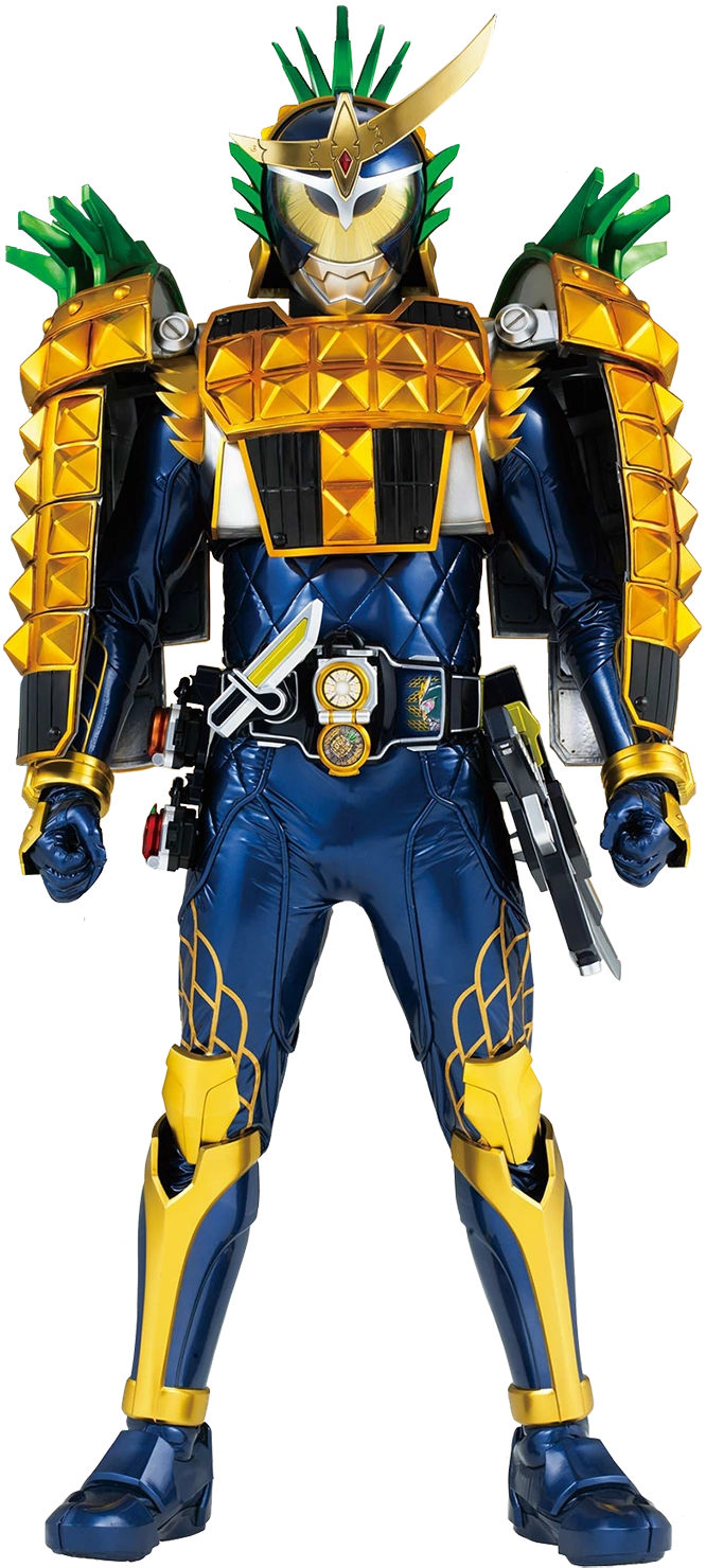
I do know of some other Lock Seed forms like Kiwi that easily could have tied with this form, but I will Pine is worse mostly because of the head piece. The green leafs around the head look silly and personally it should only have been on top of the head. I will say the chest piece is fine, but then we have the terrible should parts. First they are flimsy and just get in the way when the suit actor is trying to perform and they give the suit way too much bulk. The bottom editions of the shoulder pads are not needed or at least make them smaller and have them actually be on the suit. I so hope I don't have to see Pine Arms on any other rider.
5. Kamen Rider X

First of all, X isn't the only Showa rider on the list and yes the Showa riders are much older, but I still love most of the designs. What I don't like about X is his suit color being a grayish-blue and along with that his name is supposed to be X and yet there are "V's" on his helmet. Now they tried to make the big black "V" look like an "X" with shading the helmet with some black, but I still see a "V" overall. Also his scarf is too silly for me as the riders before him had simple scarves and his come with a logo. Then the mixture of the colors just doesn't look well, the grayish-blue with the red chest piece don't fuse well, but at least it works with the black gloves and boots. Personally I feel silver would have been a better color since his helmet clearly has that and works well with his red eyes.
4. Riderman

Here is the final Showa rider on the list and yes I explained before that I love Riderman as a character and I even love his weapons, but his design is awful. First is the helmet as his face doesn't even get covered, I really don't get why it's like that. Along with that the helmet has blue, silver, red, and green! Four colors on one helmet and it's not needed. For the big "V" just have red and silver because that would work well because his eyes are red. His yellow scarf doesn't match with the scheme as a better color would have been black or red. His chest piece is silly because the armor parts don't even cover his whole chest and has a big "A" with the same colors as the "V" on the helmet. Then his belt is just confusing, silly buttons on an solid blue arrow, that's it. It feels like Riderman was rushed to be put in the show as this is easily the worst design form the Showa era.
3. Kamen Rider Den-o Gun Form

What the hell is Gun Form supposed to be? I keep looking at Gun Form and can never understand what his motif is supposed to be. The only part I can tell it's a dragon is because of the little yellow pieces near the helmet and that's all I got. His helmet is too big with the purple piece extending too far and has a silly center piece as that easily could have just been yellow. The worst though is the chest piece, expands out way too much and just make it look too easy to break. I can easily see a piece of the chest plate just flying off if someone actually hit it with a bat. Then for a purple form it barely uses purple as silver dominates most of the suit. At least the three forms before him actually had their representing colors be the overwhelming color.
2. Kamen Rider Decade Complete

Who hasn't make fun of this form? Decade Complete is easily one of the worst designs because of that horrible chest piece. Slabbing on all the cards is unnecessary and makes it look hard to move with. Imagine trying to walk around with that on your chest? Then anything that was nice to look at in the original Decade is gone because it gets replaced with silver and black. Pink is not even that dominated in the design so there goes any nice color arrangements. Then having the belt being a tablet device is even worse than Riderman's belt because I can work with cellphones, but when we start bringing bigger devices we got a problem. Mostly the big problem with this final form is that it betrays what Decade's design had and replaces it boring colors and the silly arrangement of cards on his chest.
1. Kamen Rider Den-o Climax Form

That is my list for these terrible looking riders, if you liked any of these designs you are free to argue with me. Everyone has their own tastes so don't worry if something you like was on the list. For me these designs were just ugly or boring because unlike cool designs from Kiva or Double the ugly forms just had terrible color schemes and poor balancing. Either way though I barely get to talk about my least favorite things so it's nice to vent out some anger with the franchise at times.